Web Accessibility
But Why Though?
The internet contains a wealth of knowledge, entertainment, and communications, which everyone should be able to access. While most users are able to move their mouses, look at content, and navigate your site successfully, there is a large number of users that just can’t do this. The elderly is one example, their senses are often going and they can't move as well as they used to. There are also more specific cases, such as the deaf, blind, amputees, or anyone with cognitive disabilities. People with disabilities should of course be able to access the web just as easily as everyone else, and there are tools out there to help them, but they often require optimization on the developer side. These optimizations range in difficulty, but are significantly easier to implement if taken into consideration from the beginning.
What Do I Have To Do?
The W3C has created the Web Content Accessibility Guidelines 2.0 (WCAG 2.0) to outline the enhancements that should me made in order to make your site accessible. The WCAG 2.0 is broken down into four main objectives.
- Perceivable: Everyone is able to receive the information using the senses that work best for them
- Operable: Users are able to navigate around the website with their prefered method
- Understandable: Users can comprehend the site
- Robust: The site is compatible with as many assistive technologies as possible
There are also three levels of accessibility defined by WCAG 2.0.
- Level A: sites adhere to basic accessibility guidelines
- Level AA: sites address some common accessibility problems
- Level AAA: sites are the most accessible
Most government websites are required to be Level AA compliant. Level AAA is very hard to achieve, but sites should aim to comply with Level AA and as many AAA guidelines at possible.
Level A
1.1 Text Alternatives
1.1.1 Non-text content has a text alternative 🙈
Some people may turn off images, if they have a slow connection for instance, and some people are just blind and cannot see the images anyway. For these users alt tags are critical, so they should contain all the same information as the image.
- Use alt tags

Exceptions
Some items should have descriptive text alternatives, such as things like buttons, videos, CAPTCHAs(also need alternative methods for use).
Elements that are purely decorative should be ignored by assistive technology
1.2 Time-based Media
1.2.1 Prerecorded Audio-only and video-only have alternative formats 🙈 🙉 🤔
Users may not fully understand the information you are trying to convey in a video-only or audio-only format and would benefit from getting the information in multiple ways. Also, deaf people are unable to hear an audio track, and the blind cannot see a video, so they need another way to access the information presented.
- Audio should have a written transcript
- Video should have a written transcript OR an audio transcript
- The transcripts should be placed close to the media
Transcript
Man: How much wood would a woodchuck chuck if a woodchuck could chuck wood?
Child: The whole tree.
Exceptions
If the audio of video is already an alternative it does not need another alternative
1.2.2 Captions are provided for videos 🙉
The elderly are often hard of hearing, and the deaf are...deaf, so they need another method of getting the dialog and sound effects.
- Closed captions are one popular method
Be sure to turn on closed captioning
Exceptions
If the video is already an alternative it does not need another alternative
1.2.3 Audio Description or Media Alternative (Prerecorded) 🙈
People who cannot see should still be able to access the information in videos. Descriptive audio tracks are often used in theaters, so blind people can still enjoy the movie.
- Videos have a transcription OR
- Videos have an audio track describing what is happening
Close your eyes as you listen to get the full effect
Exceptions
All relevant information is already in the audio track (such as an interview)
1.3 Adaptable
1.3.1 Info and Relationships 🤔
There should be a logical structure to your content. One big block of text is hard for people to make sense of, and can almost always be broken down into smaller sections. Content should also, not be so distant that it does not appear to be unrelated.
- HTML markup should be semantic
- Use section headers, bullets, etc. appropriately
- Forms have a clear relationship between labels and their input field
Look at all the different sections this site has. Isn’t that much easier to read than one long essay.
1.3.2 Meaningful Sequence 🙈 🤔
Users that rely on assistive technology like screen readers will essentially only “see” the html of your page, which means the order of content in your code matters. Screen readers do not know that you moved a menu or paragraph in your css, so if the linear order of your html has a different meaning, it should be reordered.
- The sequence of content in both the html and on screen should be logical
- Menus should be separate from content
- Use headings, proper list types, and valid html
1.3.3 Sensory Characteristics 🤔
When giving instructions like “go over there,” it may be unclear where exactly “there” is without some other method of reference. Often times users may be color blind, or your site may appear to have multiple items that fit your description to the users eye, so it is best to describe instructions in multiple ways.
- Instructions should not rely solely on any one sensory characteristic
- Use a combination of color, text, shape, and location to differentiate items
Click the green “send” button on the right to send your message
1.4 Distinguishable
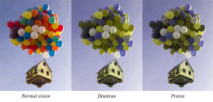
1.4.1 Use of color 🙈
People who are color blind can not differentiate between certain color pairs, or can not see in color at all, so when you tell them the information they need is in red, they have no idea which content is in red and which isn’t.
- Do not rely on color for anything, make it a secondary identifier
- Test for different types of color blindness
1.4.2 Audio Control
No one likes surprises, opening a page and being blasted with sounds can be annoying and even scare people. Also, if someone is using a screen reader they need to be able to hear their screen reader, which can be hard with audio in the background.
- Audio does not auto play
- Has play/pause buttons
Most web browsers have a default media player with the proper controls
2.1 Keyboard Accessible
2.1.1 Keyboard
People with limited mobility often have a hard time moving the mouse around, and find navigating with the keyboard, much easier, so your site should be able to be navigated using only the keyboard. Keyboard navigation is another reason it is important to consider the sequence of your site, users don't want to be jumping all over the page when they navigate.
- Clean HTML usually has full keyboard accessibility
- No functions should require timed keystrokes
- Tab and arrow keys are the standard for keyboard navigation
Try navigating around this site with only your keyboard to see how it works
2.1.2 No Keyboard Traps
It can be frustrating for users navigating via keyboard when they focus onto something and they are unable to remove focus and focus on something else.
- It is possible to navigate away from all parts of your website
- If you can tab into it you should be able to either tab out of it, or get out with another standard method such as escape of arrow keys
2.2 Enough Time
2.2.1 Timing Adjustable
No one likes the pressure of a time limit, especially those who may need more time to navigate around a site, or need more time to process the information given. It is important to respect this, and make time limits that are workable.
- Time limits should have options to be turned off or extended
- Changing content can be paused for a period of time
Exceptions
- The business depends of the time limit
- The time limit is more than 20 hours
2.2.2 Pause, Stop, Hide
Some people have trouble reading stationary text, never mind moving text, or a page with blinking or distracting movement going on.
- Moving content should be able to be played, paused, or hidden
- This includes auto-updating, scrolling, blinking, and moving content that lasts for more than five seconds
Exceptions
- If the changing content stops moving after 5 seconds or less it is fine
2.3 Seizures
2.3.1 Three Flashes or Below Threshold
Epileptics are susceptible to seizures from flashing content, and you obviously don't want to give people seizures.
- Content should not flash more than 3 times per second
Exceptions
The flash can happen if it’s below the general flash and red flash thresholds2.4 Navigable
2.4.1 Bypass Blocks
Some users, such as those using screen readers or keyboard navigation, may find it difficult and lengthy to get to the main content of a page when they have to listen to the menu be read out loud again and again on every page, or tab through tirty different menu items.
- Allow users to skip blocks of content that are repeated on every page such as navigation menus
- Provide a “Skip to Content” link
- Using proper tags and roles is another way to do this
<header>
<nav>
<main>
<h1>
<h2>
<footer>
2.4.2 Page Titled
Having a title allows users to quickly change between tabs, and identify the current site they are on.
- Use the title tag
<head>
<title>Accessibility Reference</title>
</head>
2.4.3 Focus Order
Users with visual or physical impairments that rely on keyboard navigation cen become confused it they tab somewhere unexpectedly.
- Put DOM elements in the order they are seen
Exceptions
If the order of focusable elements has no impact of meaning or function, then the elements can be in any order.2.4.4 Link Purpose
Links should have some sort of context for users to figure out where exactly the link goes. This is particularly helpful for those with cognitive impairments, as well as those which rely on screen readers.
- Links should say exactly where they are taking users
- Buttons should say exactly what they do
3.1 Readable
3.1.1 Language of Page
Screen readers need to know which language a page is in to get correct pronunciations.
- Page has a language assigned
<html lang="en"> </html>
3.2 Predictable
3.2.1 On Focus
Changing focus shouldn’t do anything except change focus. People with cognitive disabilities may become confused when something happens they did not intend to, just by changing the focused element. When users intend to follow a link while using keyboard input they will hit enter, or spacebar.
- Links don't automatically open on focus
- Submit buttons don't automatically submit on focus
Google.com
Tab over to this, or any other link and you will notice it does not automaticaly open.
3.2.2 On Input
On input of text or upon changing any settings, there is no unexpected change in context. People with visual impairments may not notice the change and wonder why they cannot navigate as expected.
- Forms do not automatically send
- Users have a chance to review before submitting
Click a button to change the color of this box
Exceptions
A change of context is okay, as long as users are warned beforehand, like in the color changing example to the left.
3.3 Input Assistance
3.3.1 Error Identification
When filling out a form people often make mistakes, so it is helpful to have some kind of error checking. Error warnings need to be clear enough for people to understand what they did wrong. This is especially important to people with cognitive disabilities, and the blind, who can not see that you changed the color of the field to red.
- Input errors are clearly marked with a text description of what went wrong.
Try to submit this form without entering anything and you will notice the error message provided by the browser. Adding “required” into the input tag will tell the browser there should be content in this text field.
3.3.2 Labels or Instructions
When users get to a form on your website they need to know what the form is for and what information to input. The easiest way to do this is by labeling the different input fields.
- Input elements are labeled and have instructions
Notice how the labels next to the text fields let users know what information goes where.
4.1 Compatible
4.1.1 Parsing
In order for assistive technologies to parse a page correctly elements should have closing tags, proper nesting, and be correctly coded.
- Code is valid, with no major errors
Use a validator, such as W3C’s
4.1.2 Name, Role, Value
All code for the site should be valid and adhere to accessibility guidelines, including any third party plugins, non-HTML elements.
- ALL code is valid
Use a validator, such as W3C’s to check not only your code, but any plugins.